Overview
Pride Wide
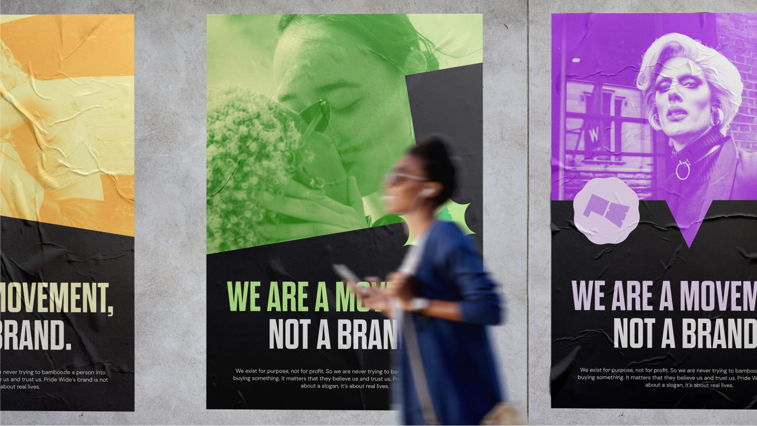
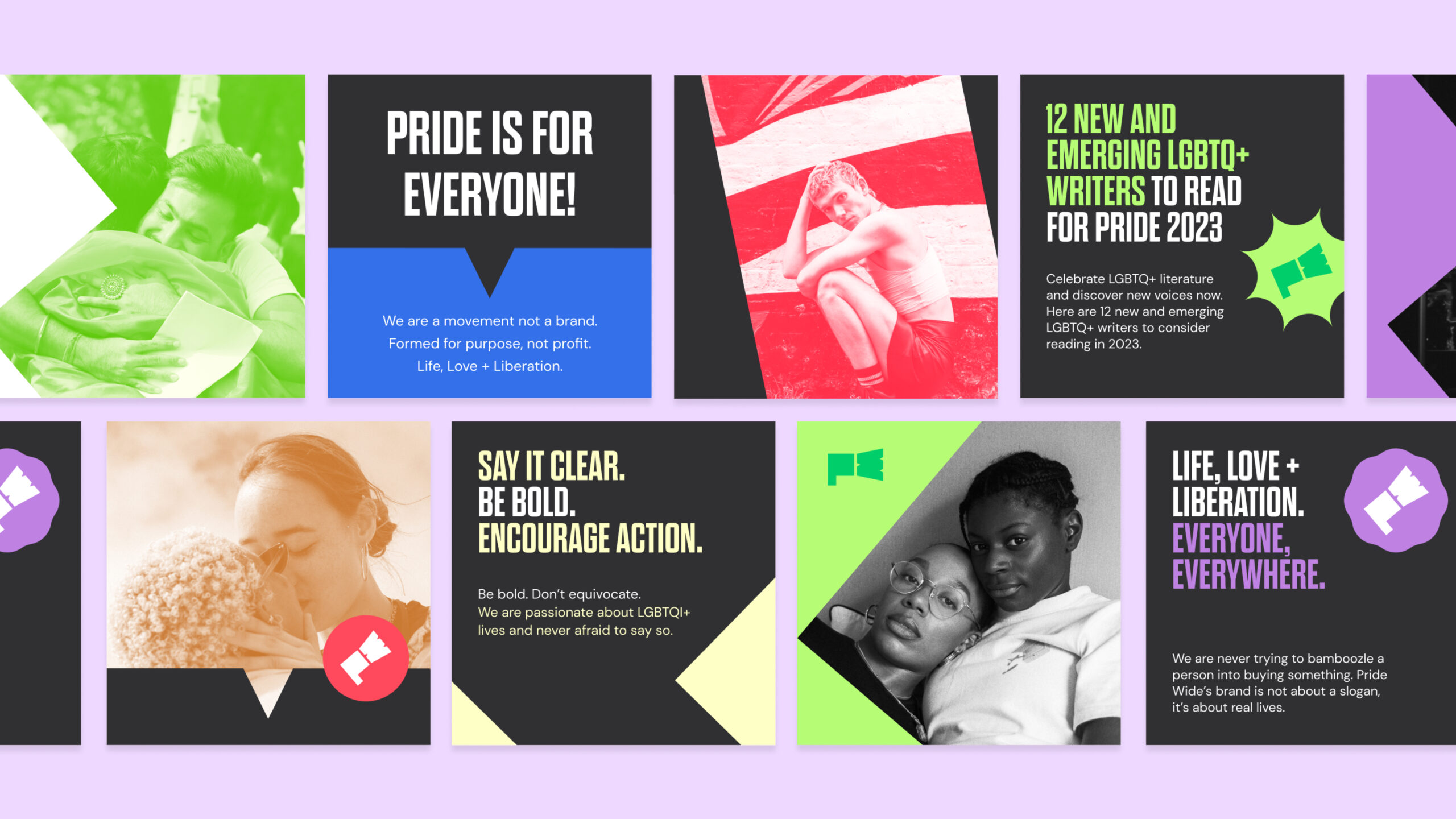
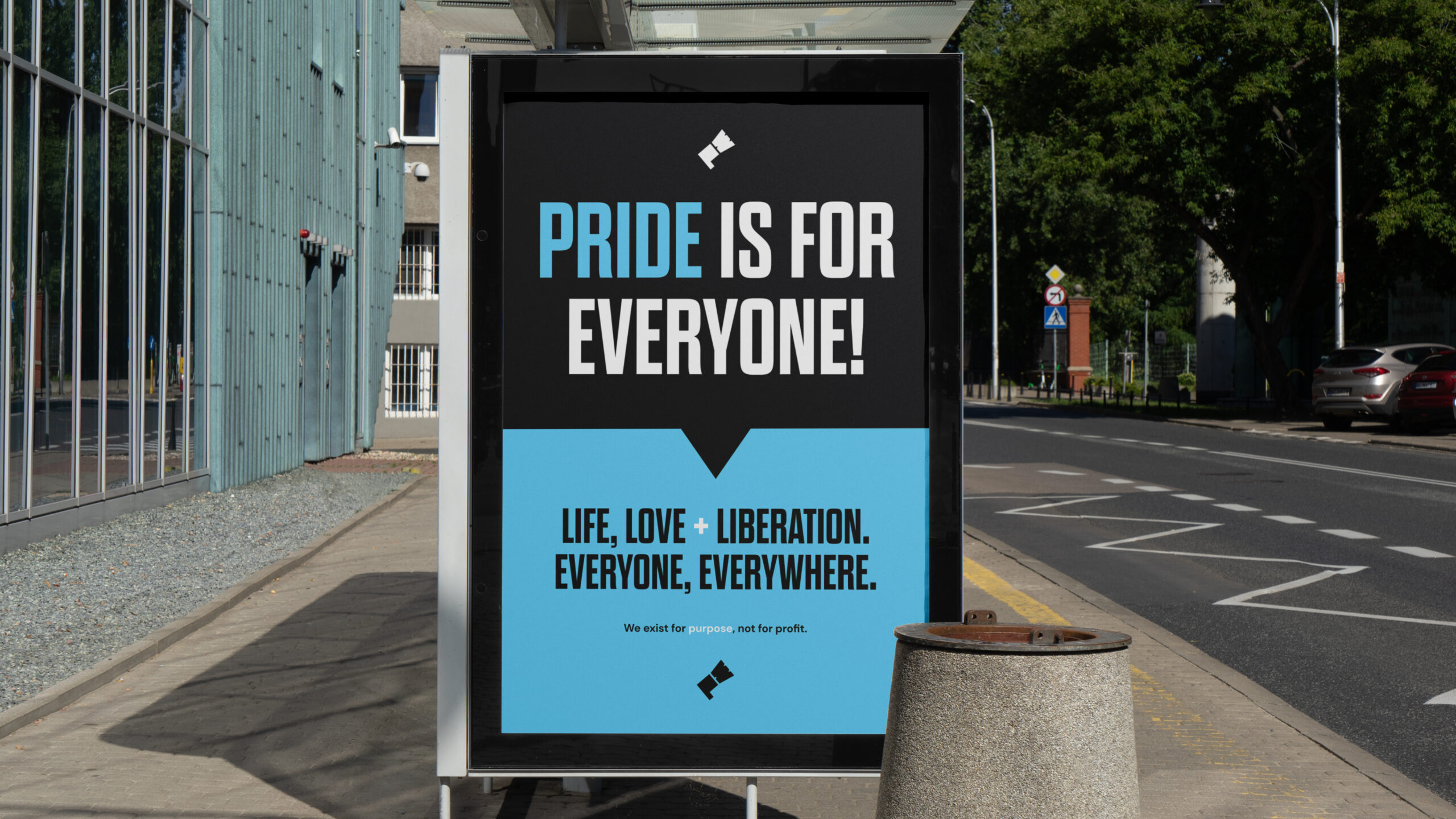
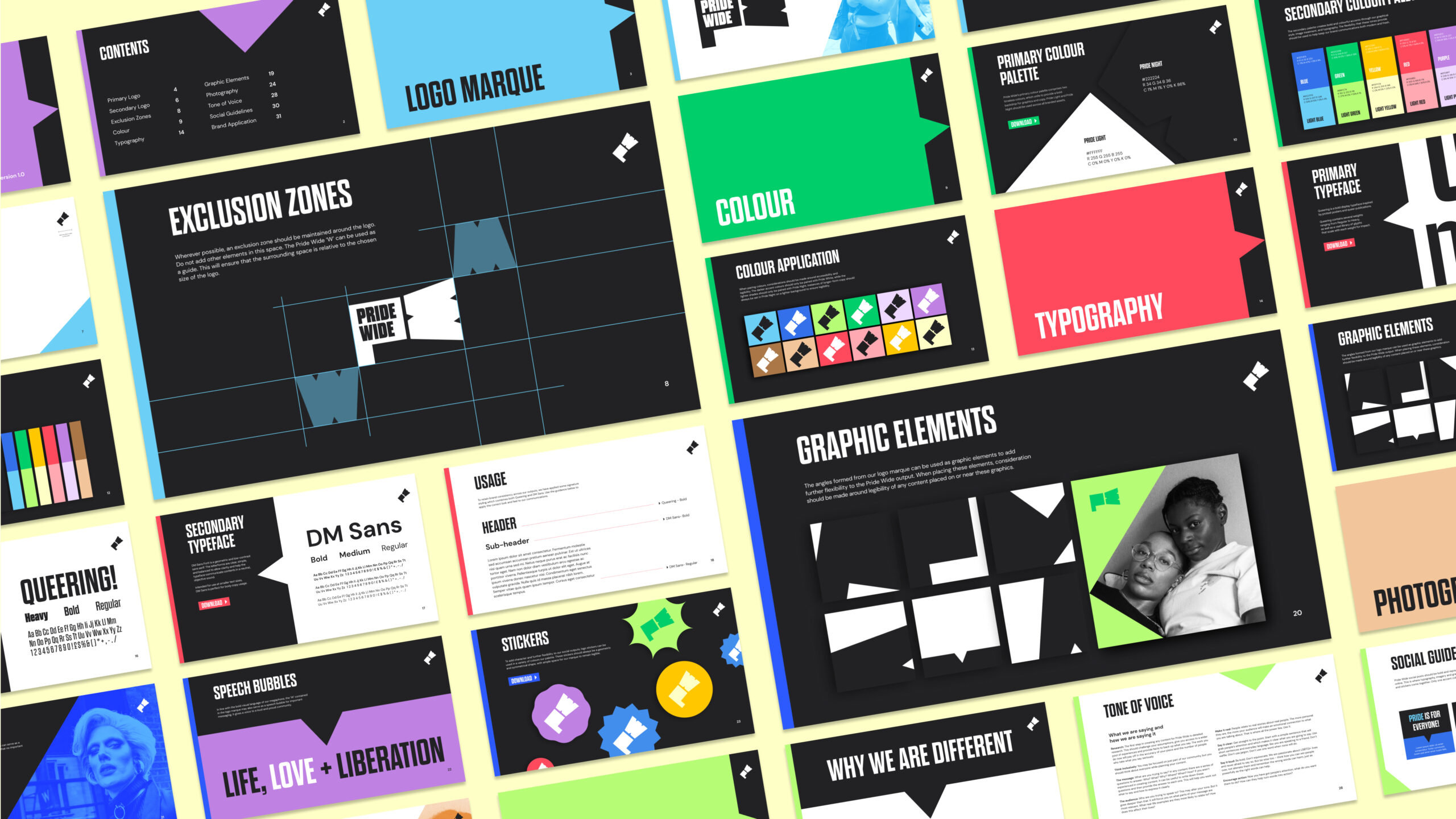
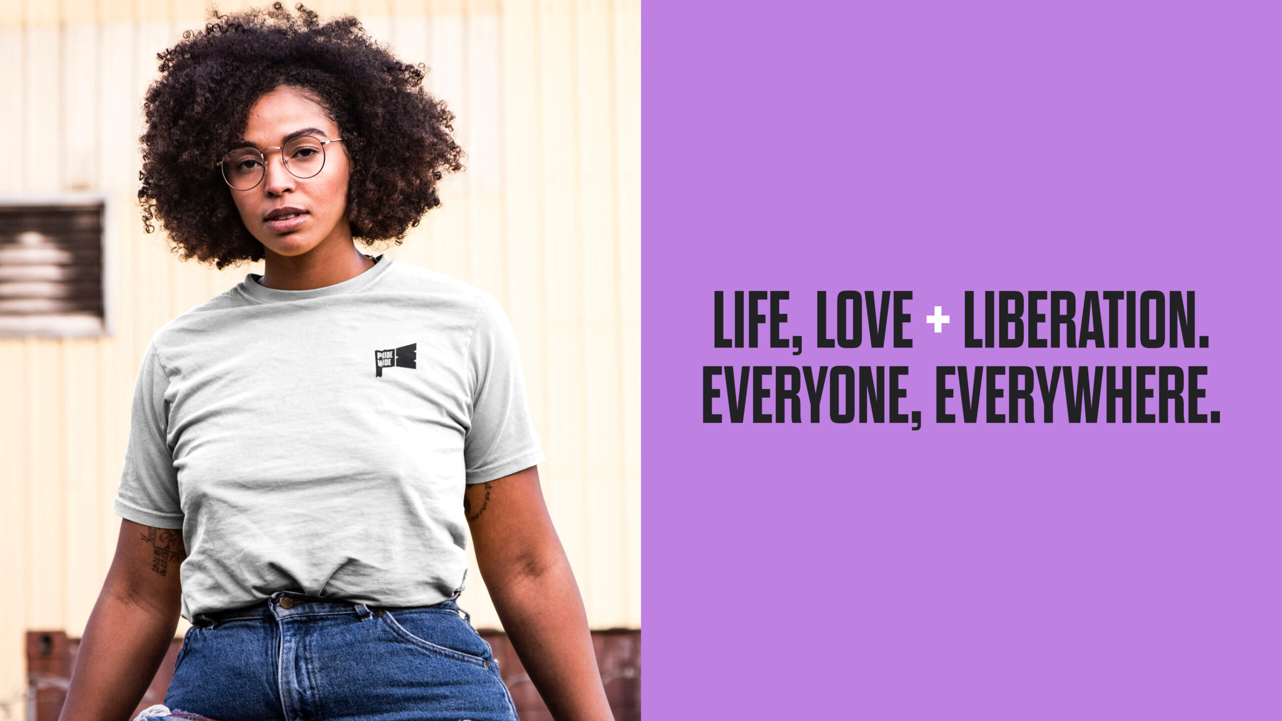
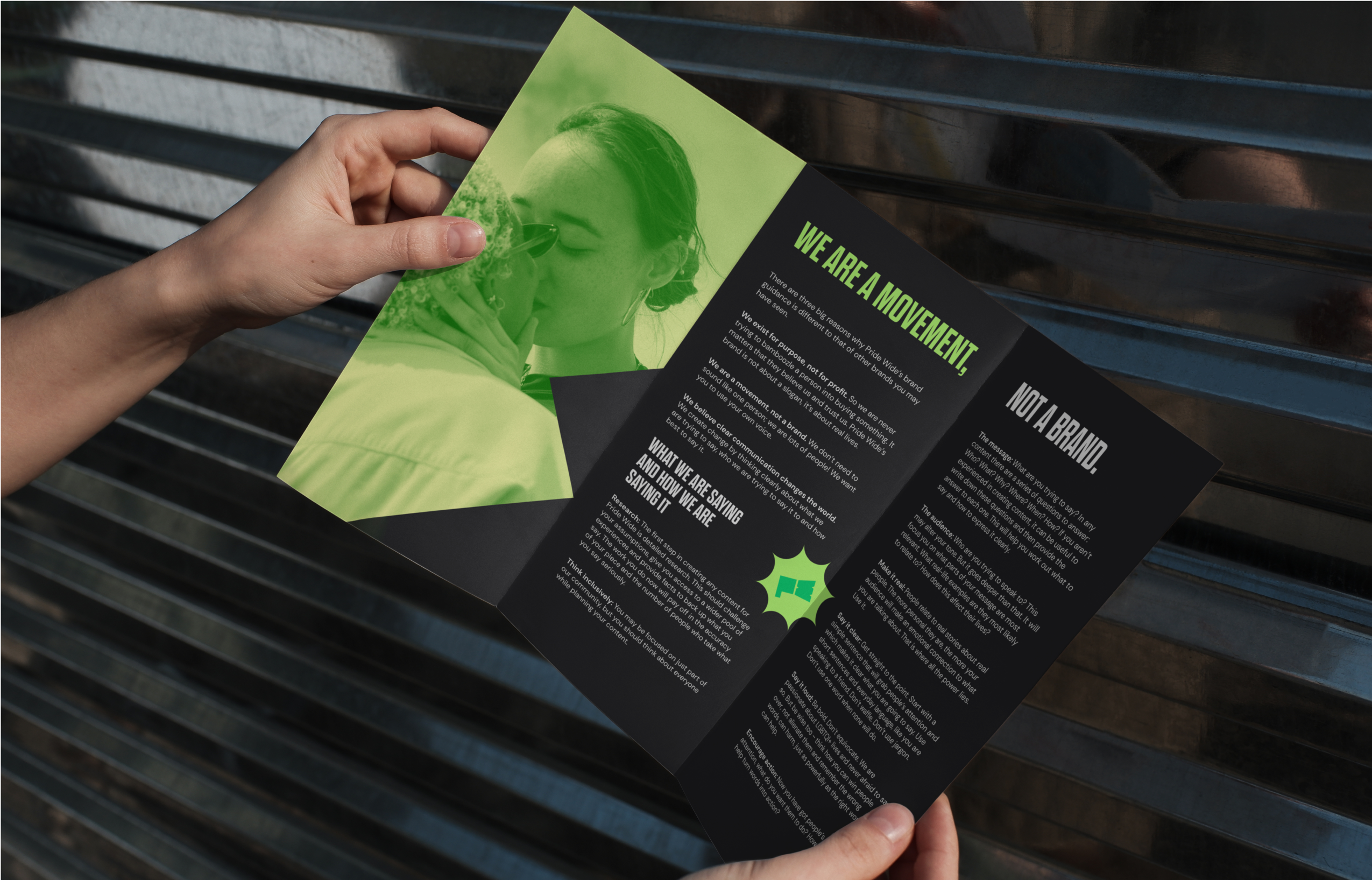
Pride Wide is a movement, not a brand! As a global charity, they use the power of conversation and media to raise the voices of LGBTQIA+ people to drive social change. In crafting a distinctive brand identity for Pride Wide, the primary goal was to provide a powerful voice for the community it represents.


The Team
Client
Pride Wide
Pride Wide is a movement, not a brand! As a global charity, they use the power of conversation and media to raise the voices of LGBTQIA+ people and make change.
Team
Charlie
Andrei
Fran
Team Regency may be small but we make up for it in experience. We’ve helped clients in some of the most challenging and crowded industry sectors to develop stronger connections with their customers.